Intuitive Investor Automated Brokerage Advisor
The Challenge
Design a financial investment experience that encompasses user product education, guidance, onboarding, and account management. I would need to navigate complexities surrounding investing and regulations, limitations of existing tech, and user knowledge.
This was a massive, year long project that was spread across teams throughout the US.
The Approach
I partnered quite closely with other project leads on this. First to understand the goals of the project and what the definition of success would be. Then to understand the user motivations and touch points. None of what we were building existed for Wells, so we had a rigorous design and testing schedule.
User testing was key, and I worked directly with our researchers to develop testing guides, as well as sit on calls with clients and engage them directly as needed.
The Final Product
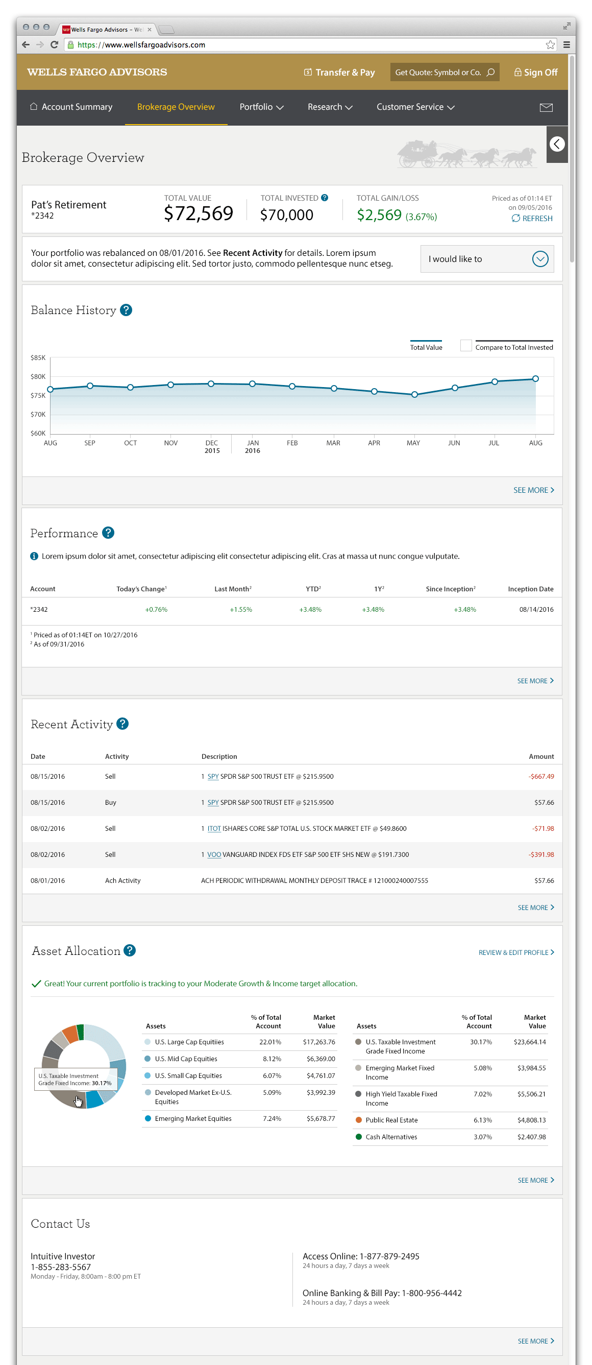
I led the design team for the client dashboard portion of the experience. We launched a pilot that encompassed the very best design approaches taken from extensive user testing.
The Impact
The product would be named “Intuitive Investor” and is a milestone for Wells Fargo Advisors as it is their entry into the automated investment market dominated by startups, bringing their name recognition.

Account Dashboard
I worked on several areas of the overall experience, however the dashboard was the experience I led the design and spent most of my effort on.
I served as the Lead for the client dashboard experience of Intuitive Investor.
Leading this portion of the project included being the point person for the design team to the project team and to Senior Management. I aligned the design team with the Product Owner to settle on the definition of the problem and success for us, and what precisely we would deliver. I then would compile a UX Plan which outlined in detail what was decided, and the milestones for delivery of the specific artifacts we would create.
I drew up a modified Double Diamond map that made it easier for Product Owners and Management to understand how design would go about solving the problem. It’s one thing to include a list as part of the plan, but including a visual map gives that added feedback of where we are in the process and how close to the finish line we are.
© 2025 Apex Application Design