In my career, I’ve had the pleasure of working in several diverse industries. These include finance (Fintech), healthcare, insurance, e-commerce, even console and PC games. On the surface, none of these industries have much, if anything in common. So how was I able to be a part of these and remain successful throughout each engagement?
The simple answer is that they all have an end user component, and that user has a set of goals, tasks, wishes, needs, and motivations for using the platform. Those goals can be broken down into a single idea…the user’s intent.
User intent can always be broken down into a singular statement or task. When that is kept in mind, complex data driven applications don’t seem so complex anymore. The truth is, we can throw a multitude of options and data at someone using our system. We can design interfaces that look like something straight out of a sci-fi movie. But if we keep in mind that the user can realistically interact with only one thing at a time, and that they have a singular goal for that step, then we can design a pathway for them that is intuitive and alleviate the feeling of being overwhelmed.
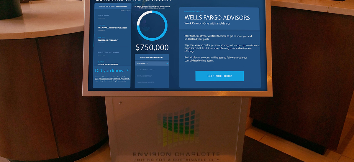
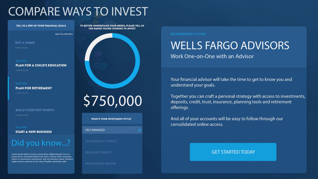
Take for example, a concept I designed for getting a recommendation for an investment product.
There are several challenges to overcome to build something like this:
- The very idea of finance and financial advice is often a dark cloud for your average person. It is asking a lot for them to even know where to begin.
- Asking users to interact with a kiosk type of input platform (which is very public) and answer questions about their personal financial goals or situation is very counter-intuitive.
- Communicating to business management that this tool is ultimately not the start of a sales funnel.
Here’s how I approached these:
(1) There is a design methodology that I am a huge proponent of called progressive disclosure. If you’re not familiar with it, in a nutshell it means to only display items on screen that a user specifically requested or should be expecting from a previous interaction. In this way, everything on screen is directly related to them. Even if it is many things, they understand what their relationships are to what they want.
This was a perfect way to ease an average person into the deep end of financial advice.
(2) A critical point that we needed to convey was that this was something to use to understand what’s available, not to sell you on something specific. Much in the same way the auto industry uses “build your car” features. It’s a way to see what you’d want and what might work for you given a few factors. The radial dial to input the investment amount, I expected no one to supply a real amount. It was a mechanism to play with. And tying that with “investment style”, users were intrigued by the use of “style” and selected them all to see their differences.
(3) It’s not a sales funnel. Why not? Because we haven’t qualified anyone. We don’t know anything about them and don’t have a way to get it in this manner. The purpose of the tool is education. It is to first promote the options available from the organization to help with financial goals. It is second to dispel the notion that financial literacy is well within anyone’s reach, and the first step of getting started is not as complicated as it may seem. Seeking advice on this kind of personal matter is much easier when you know what questions to ask (and what you can answer) to a professional.
Managing expectation that anyone who finalized their input and clicked “Get Started” is just shopping and comparing. No one was sold at that point and no one was ready to open any accounts. It really meant they’re ready to learn more. This was great, because the beginning of their financial literacy was going to be at the hands of the organization. Not direct revenue, but a definite win.
Overall, this illustrates the value of design from the user’s intent and how it can be applied to any type of interaction. Business motivation has to be secondary. If you intend to push a solution rather than solve a problem (there’s a difference), then you’re not listening to what your user base wants. Get to the bottom of the one thing they’re trying to do.

